Recently, as part of my research, I implemented a modified version of the algorithm detailed in this paper. While it was unsuitable for the intended purpose, the process did yield interesting results in the form of three-dimensional color-frequency histograms.
First, a quick introduction to the concept of a color space: Colors are usually described, additively (starting from black and adding light) or subtractively (starting from white and subtracting light). The former is usually used with screens and computer displays (which work by adding light), and the latter with print materials (which work by adding pigments, which subtract light). By no means does this depict every possible color, but it does an excellent job in specifying colors for use by digital devices. The RGB color space is the most commonly used color space in digital images, simply because its use makes it very easy for displays to directly use, and for printers (or other devices) to convert to the appropriate format.
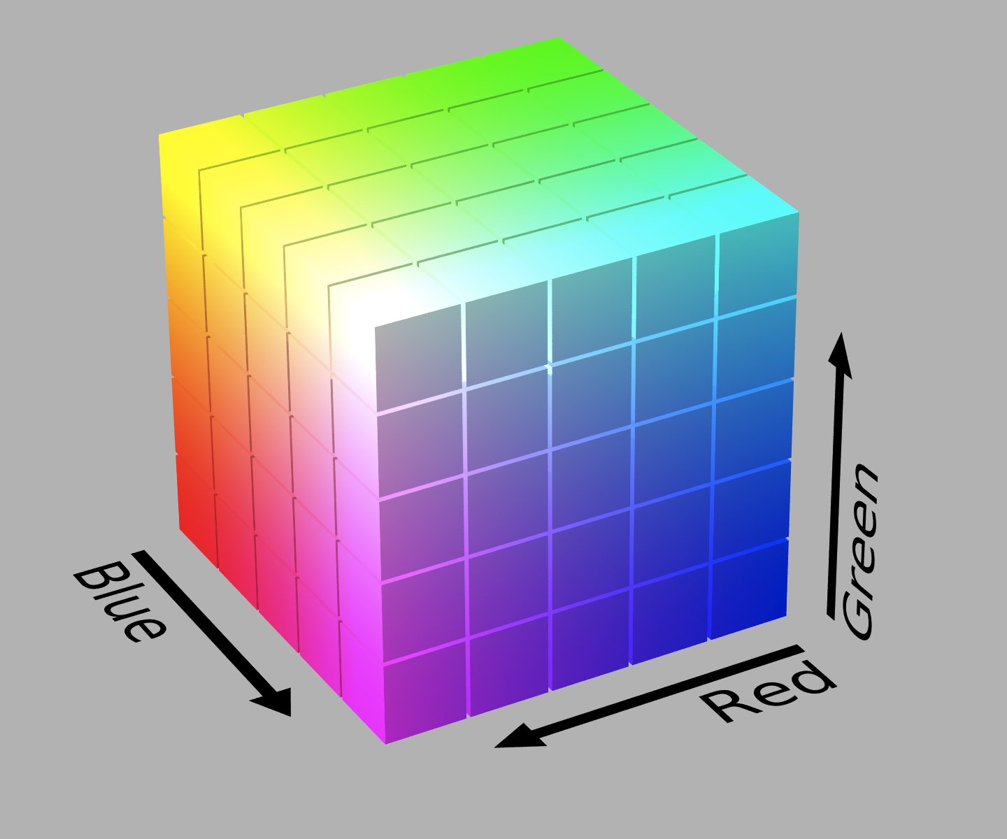
RGB is usually specified by a set of three numbers (each representing the intensity of red, green or blue present in the final mix, as an integer from 0-255 or a fraction from 0-1). Since these three colors are assumed orthogonal in human perception, they can be drawn in a cube, with each color varying along one dimension of the cube. This means that each point in the cube can be described using a unique set of three numbers, and that each set of three intensities describes a particular, unique, color. The image below expresses this concept visually:
The purpose of a histogram is to calculate which colors are most popular in a very simple way. The entire RGB cube is divided into “bins” of equal size, where each bin corresponds to colors that belong to the same ranges of intensities of each primary color. The divisions in the image above divide the larger cube into 53 = 125 bins. It is important for the “size”, the range of colors that each bin encompasses, to be perceptually uniform. This is not the case in the RGB model, but we can live with the assumption for now. In the final histogram, each bin contains the total number of pixels in an image that fall within its range.
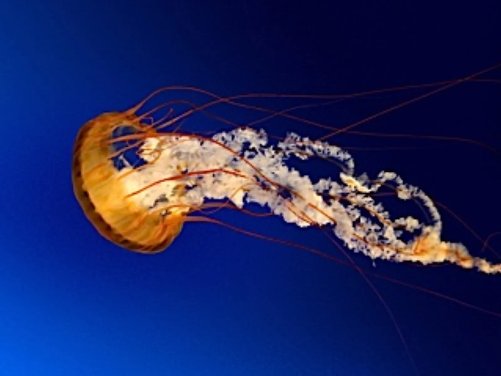
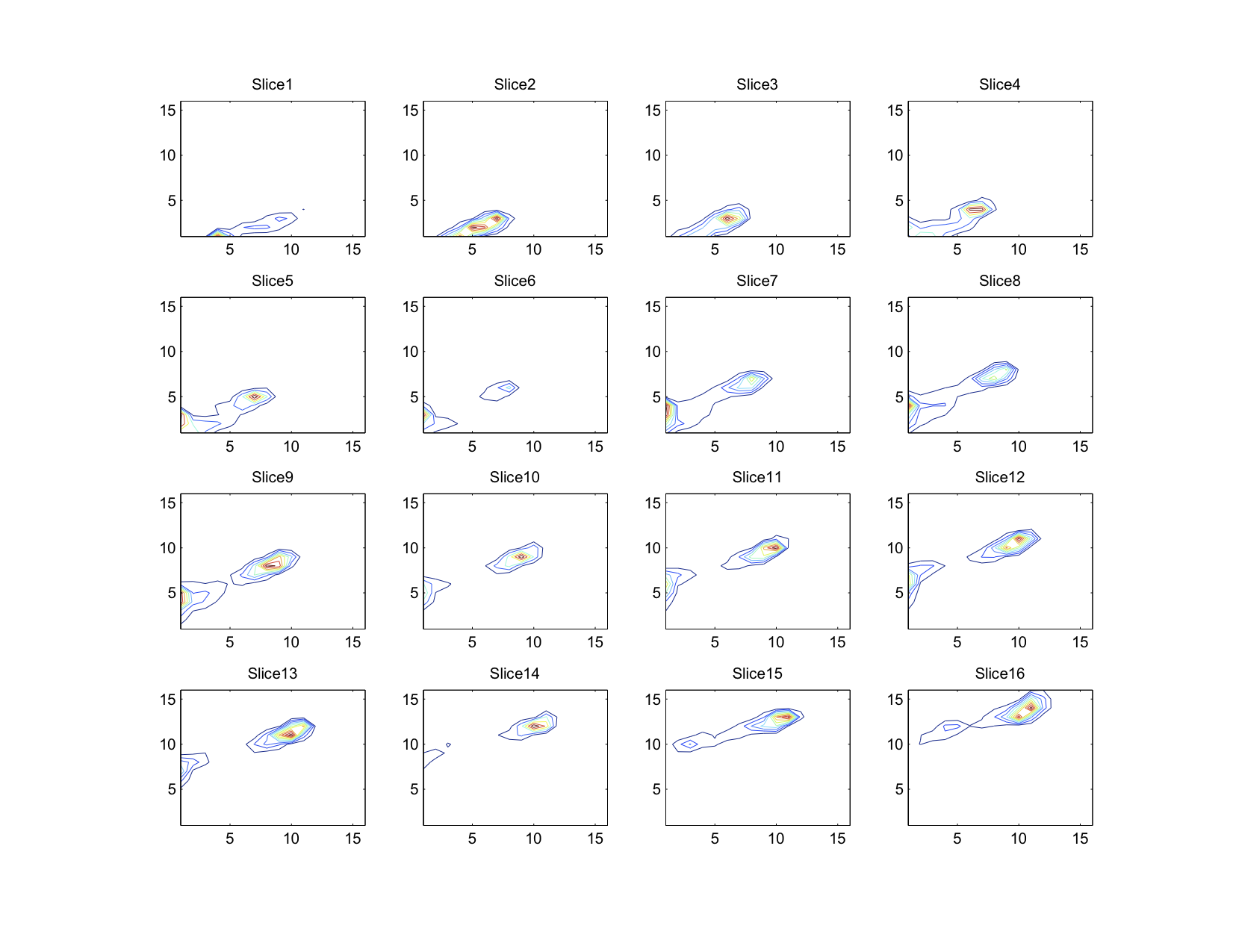
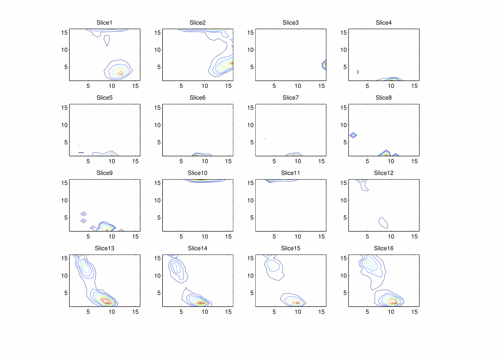
With all this knowledge, we can now see that a three-dimensional histogram is simply a record of the color distribution within an image, and so can be used to find out the particular color or color groups that are most common in an image. One particular image of interest is Jellyfish.jpg, from the sample pictures included in modern versions of Windows.
This image was processed to yield a 3D histogram as described above (but with 163 = 4096 bins) and converted into a “stacked” contour plot. Each layer in this stacked plot corresponds to moving towards the maximum intensity of red by one bin (or 1/16 of the maximum color). Within each layer, the colored lines enclose areas within the histogram that all contain more than a certain number of pixels. As in a geographical contour map, the minimum limit for each contour line increases linearly.
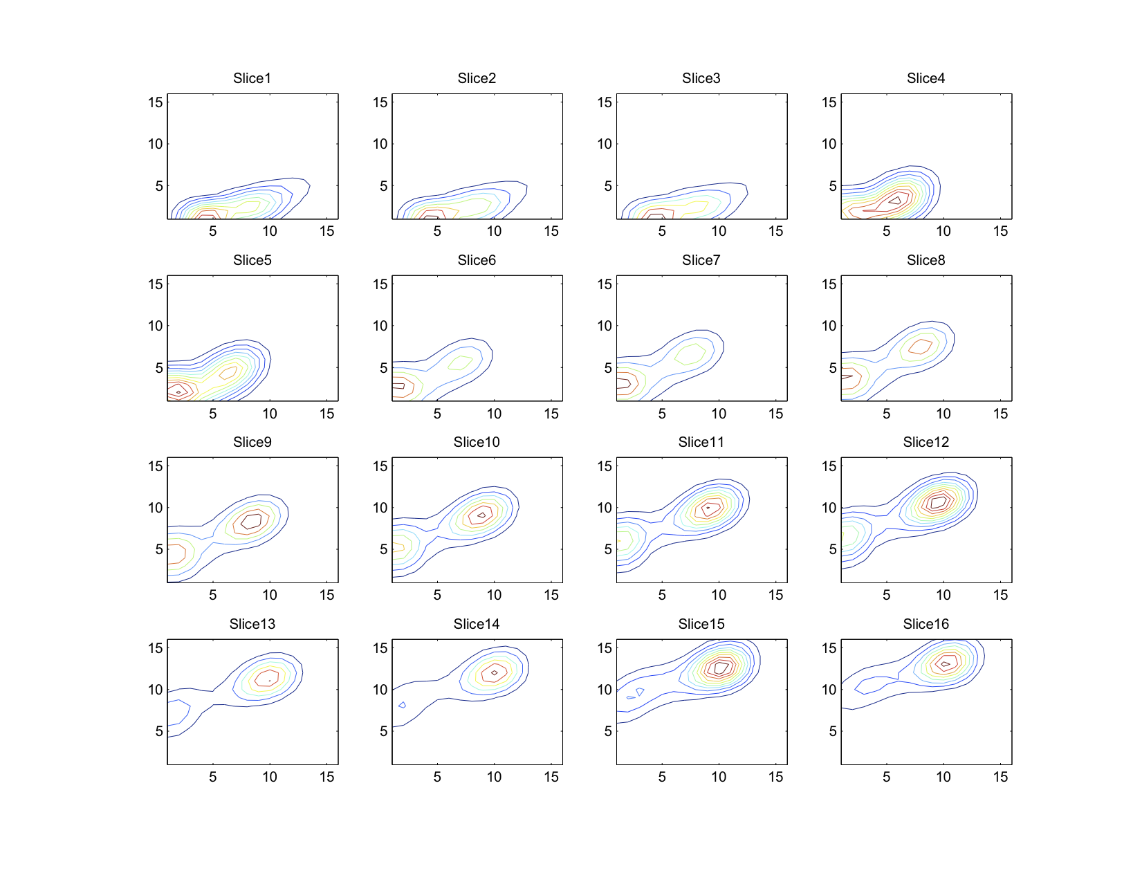
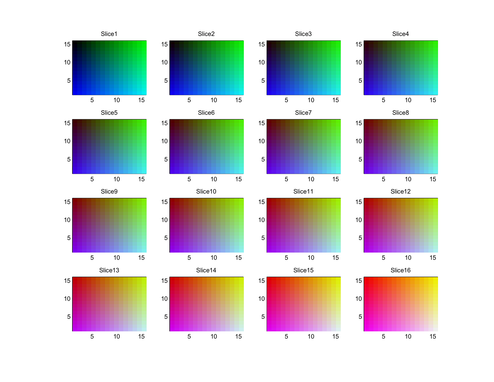
It is easiest to imagine that all the slices are vertically stacked and that lines of similar colors are connected between layers. Doing so will give you a series of polygons enclosing colors that all occur at least a certain minimum number of times. For quick reference, the color of each bin can be seen here:
It is easy to manually verify that the most common maximum colors are the dark blue of the background and the orange of the jellyfish.
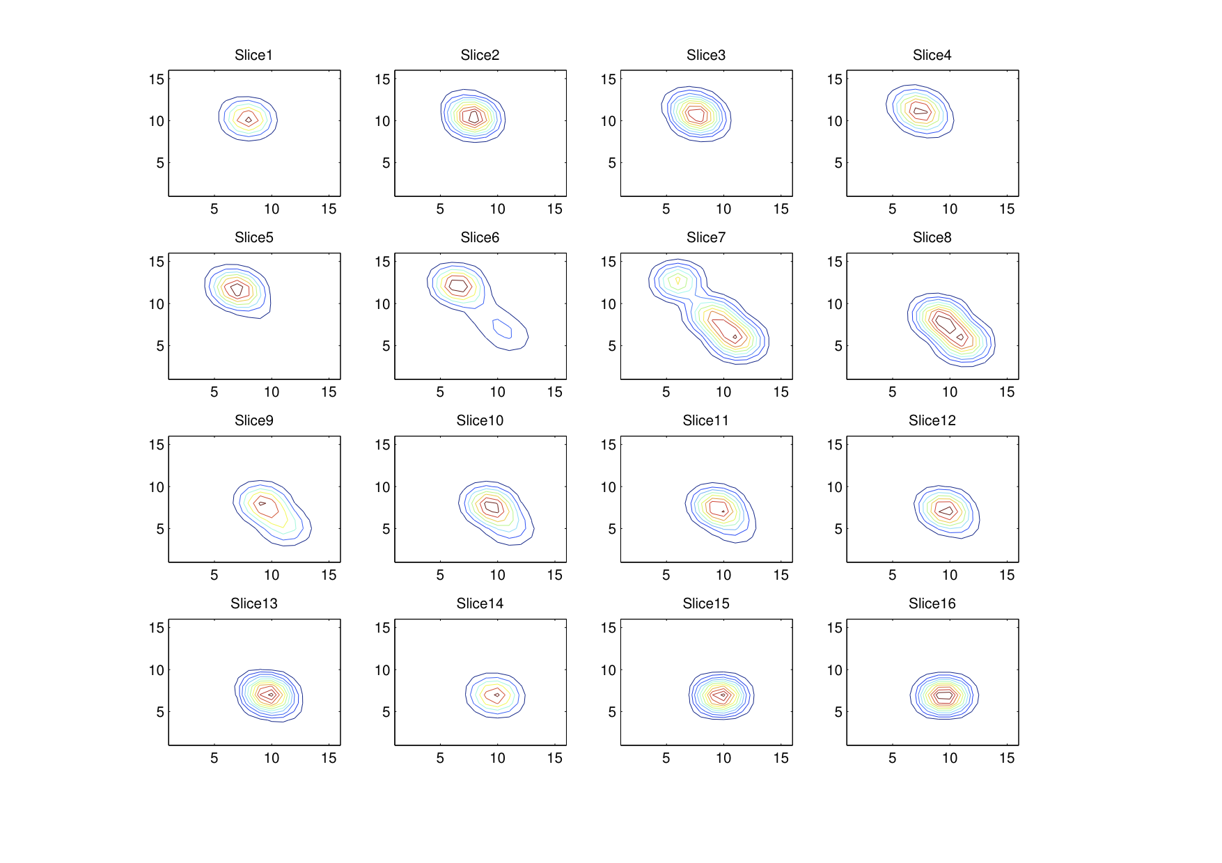
Of course, this particular histogram has been smoothed. The original histogram, as shown below, has considerably thin peaks, suggesting that colors within a group tend towards a central value rather strongly. A three dimensional Gaussian convolution matrix was applied (with sigma = 1.33 bins) was applied to get the rather nice looking histogram above.
The whole process relies heavily on a few key assumptions. Perhaps the most important assumption is that the intensity of a particular color varies linearly with the value used to express it. As far as the RGB color space is concerned, this is not true. This leads to the process being non-representative in a number of important ways:
- Smoothing is not representative of colors perceived.
- Color grouping is likely to be too aggressive in colors where human eyes can differentiate shades the best and not sufficiently aggressive at other colors.
If you have managed to read this far, then congratulations! Here is the same data in other color spaces.
YCbCr
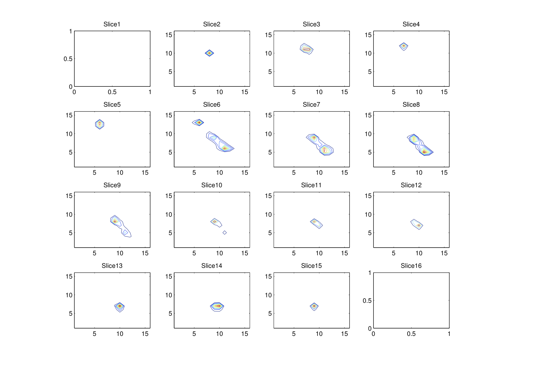
HSV
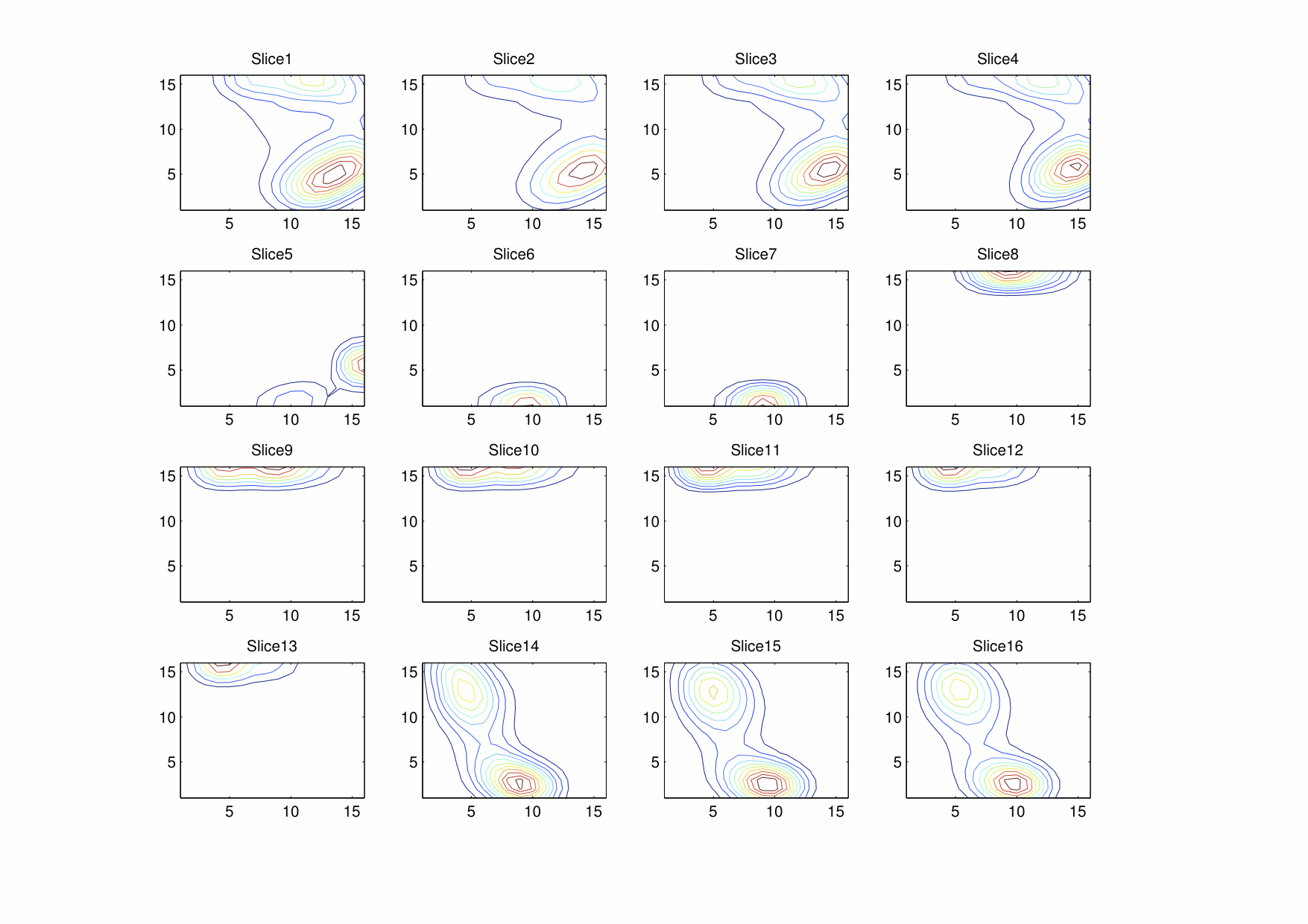
Do note that the Gaussian smoothing used does not “wrap around” the hue dimension in the smoothed HSV histogram.